Built an OSINT platform for investigators and security services

Made CrimeWall easier to adopt and scale. In just 4 months we shipped a refreshed version, cut onboarding time from 3:30 to 1:15, reduced support tickets by 34%, moved design in-house, and slashed design costs by 3x. The feedback from clients was overwhelmingly positive.
When I joined SocialLinks, CrimeWall was already helping investigators, private detectives, and government teams uncover tough cases: from crypto scams to drug trafficking and child exploitation. The product worked, the company was growing, but the market was speeding up. Competing only on features wasn't enough anymore. We needed to be faster and way easier to use.
My role wasn't just about making pretty screens. I was responsible for shaping design strategy, building the team, and ensuring design directly impacted both product and business outcomes.
What shaped the work
At that moment, CrimeWall had two big issues. First, the product was powerful but difficult to use. The information architecture was confusing, and new clients could not get started without a personal onboarding session. Sales literally had to walk every user through the tool. We wanted to flip this around and make the product usable even for someone who had never touched OSINT before.
Second, the design team itself was outsourced. We were paying three times more than we should for output that was uneven and detached from the company's goals. If we wanted design to truly shape the future of CrimeWall, we needed to build that function in house.
And there was one more layer of complexity: research. In OSINT, discovery is not like in other SaaS products. Many users refused to show their identity. Some joined interviews masked or with cameras off. Others kept their feedback short and emotionless, for obvious reasons. Finding ways to collect honest input was a problem of its own.
Create the best in class OSINT tool by making it easier to learn, faster to use, and cheaper to evolve. Prove that design is a lever for product and business results, not only aesthetics.
- 01Fix the information architecture and taxonomy so new users understand what to do without a live guide.
- 02Build a durable design function in house that compounds knowledge and cuts cost.
- 03Ship a refreshed, accessible UI that holds up on low quality monitors used by some field teams.
- 04Set up a continuous discovery loop that works in a sensitive domain.
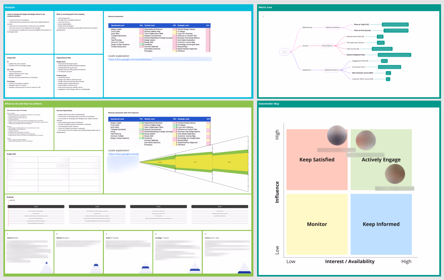
I developed a design strategy that tied directly to product growth and business outcomes. I mapped out what we needed to accomplish across product maturity, team health, and strategic influence.
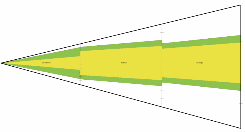
I started with an assessment of design and process maturity — where we were, where we needed to be, and what the fastest path looked like. I identified leverage points and sequenced the work accordingly.
To keep strategy grounded in impact, I introduced a metric tracking system that connected design decisions to measurable outcomes. Every major initiative had a hypothesis and a success metric before work began.
I also built a stakeholder map to understand influence and interest across the organization — which helped me prioritize conversations and get design into product decisions earlier.
The first thing I did was cut ties with the outsourced design vendor. I hired two senior designers in-house, both with product backgrounds, and immediately slashed design costs by 3x while gaining far tighter alignment with engineering and product.
From day one, I set up rituals: standups, design reviews, design critique sessions, and quarterly planning. This gave the team connection and a shared sense of direction — and made design work visible across the company.
Since interviews were limited by the sensitive nature of the domain, I created multiple alternative feedback channels: anonymous surveys, in-product feedback widgets, session replay analysis, and a structured customer advisory board with trusted users who agreed to be identified.
Within weeks, we saw the real picture. The biggest blocker wasn't feature gaps — it was the first hour. Users who couldn't complete their first project without help churned almost immediately. The solution wasn't more features, it was clearer paths.
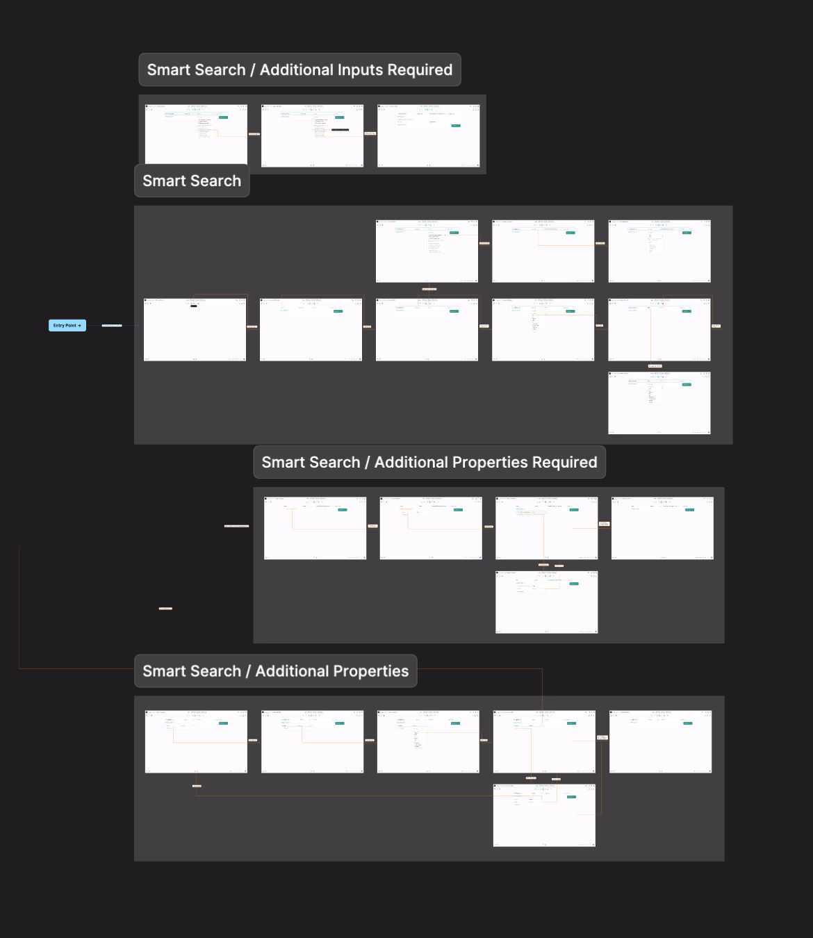
We restructured the information architecture from scratch and eliminated the dead-end flows that caused new users to get lost. We reduced the number of steps to initiate a project from seven to three, removed duplicate navigation patterns, and simplified key decision points.
The new onboarding introduced A/B-tested tooltip flows that guided new users without interrupting experienced ones. Time to first project dropped from 3:30 to 1:15.
Alongside structural changes, we also addressed the visual layer. We introduced a consistent type system and ensured that the UI remained legible and accessible on lower-quality monitors commonly used by field teams in law enforcement and corporate security.
Every component was rebuilt with accessibility in mind — sufficient contrast ratios, keyboard navigability, and screen reader support.
The new design system made it possible for the product team to ship new features without requiring design involvement for every small decision — components accelerated output, maintained consistency, and compounded knowledge over time.
Within the same quarter, the product team launched three new features mapped against our design templates, with no additional design resources required.
Thanks to the Frustration Score framework I implemented, we could now track dissatisfaction in near real-time without waiting for support tickets to pile up.
The outcome
Four months in, we shipped the redesigned CrimeWall. Onboarding time dropped from 3:30 to 1:15. Support tickets dropped by 34%. Customer clients responded with clarity and success.
Inside the company, design became more than a service function — it became a strategic lever. From one outsourced resource to a fully in-house design team that moved faster, communicated better, and cost significantly less for the output we were generating.
Lessons learned
The biggest insight wasn't about design itself. It was about alignment. When I realized that the first mistake adjustment that works on the job is about the first minute adjustments that help the user design, it became clear that the biggest competitive advantage in design isn't about looking different, it's about how much faster you can remove friction.
The deepest lesson in this project: design leadership is not about design. It's about finding the highest-leverage point in the system — whether that's a product, a process, a team structure, or an organization — and removing the constraint that holds it back.